
explore
fusers reserve design tips
Working with unique glasses that are often bold and dynamic
This popular line of limited edition Oceanside Compatible® glass opens up amazing possibilities to fusers of all skill levels — each sheet bringing something unique to the design table. Following are a few "tips and tricks" for working with the various stirs and looks the line can deliver.
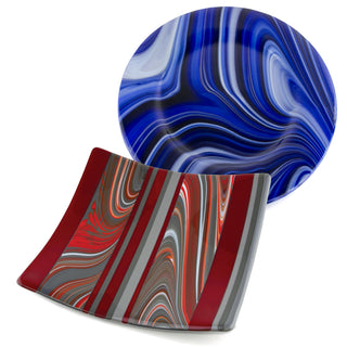
accenting the
Dynamic Stir Pattern
Many Fusers Reserve products have a strong, swirling pattern that we refer to as our “OpalArt™ Stir.” It’s a bold look — use it boldly. Let it be the entire piece, or accent it lightly, but allow the motion of the Fusers Reserve take center stage, as in the two examples here.
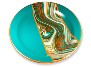
working with
Bold, dense color
The “OpalArt Stir” is very dynamic and when paired with dense rivers of strong color, it makes a strikingly beautiful statement. It helps to be very conscious of what’s going on with your design when you’re using such a bold glass. The Southwest Fusers Reserve featured here is set off by large areas of solid Peacock and perfectly accented with a small amount of Persimmon. Accenting with colors that appear in the Fusers’ Reserve sheet itself is always a safe bet.
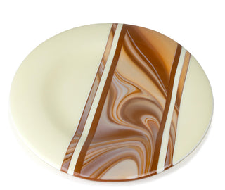
identify
Complementary Colors
Choosing colors to use with a Fusers Reserve is a big part of the fun in working with the line but sometimes it can be a difficult to choose just what will bring out the very best in the glass. We try to study the glass and let it “talk to us” as much as possible. In the example here, the rich color in the swirls reminded us of sweet caramel, so pairing it with buttery Vanilla Cream was the perfect recipe.
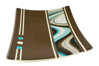
work toward a
balanced design
Sometimes you can get a section of glass with an OpalArt stir that is more linear than swirled. We found such a sheet and thought it was so lovely — very “painterly” — that we accented it only minimally and let the artistic lines speak for themselves.
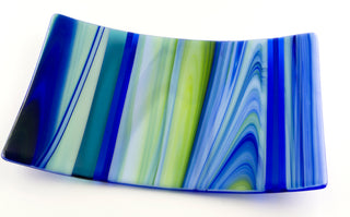
Less Can Be More
Sometimes you can get a section of glass with an OpalArt stir that is more linear than swirled. We found such a sheet and thought it was so lovely — very “painterly” — that we accented it only minimally and let the artistic lines speak for themselves.
Experiment and play around with different ideas — dive in and enjoy the creative process!

Grid item
Perfect for lookbooks and editorial photography

